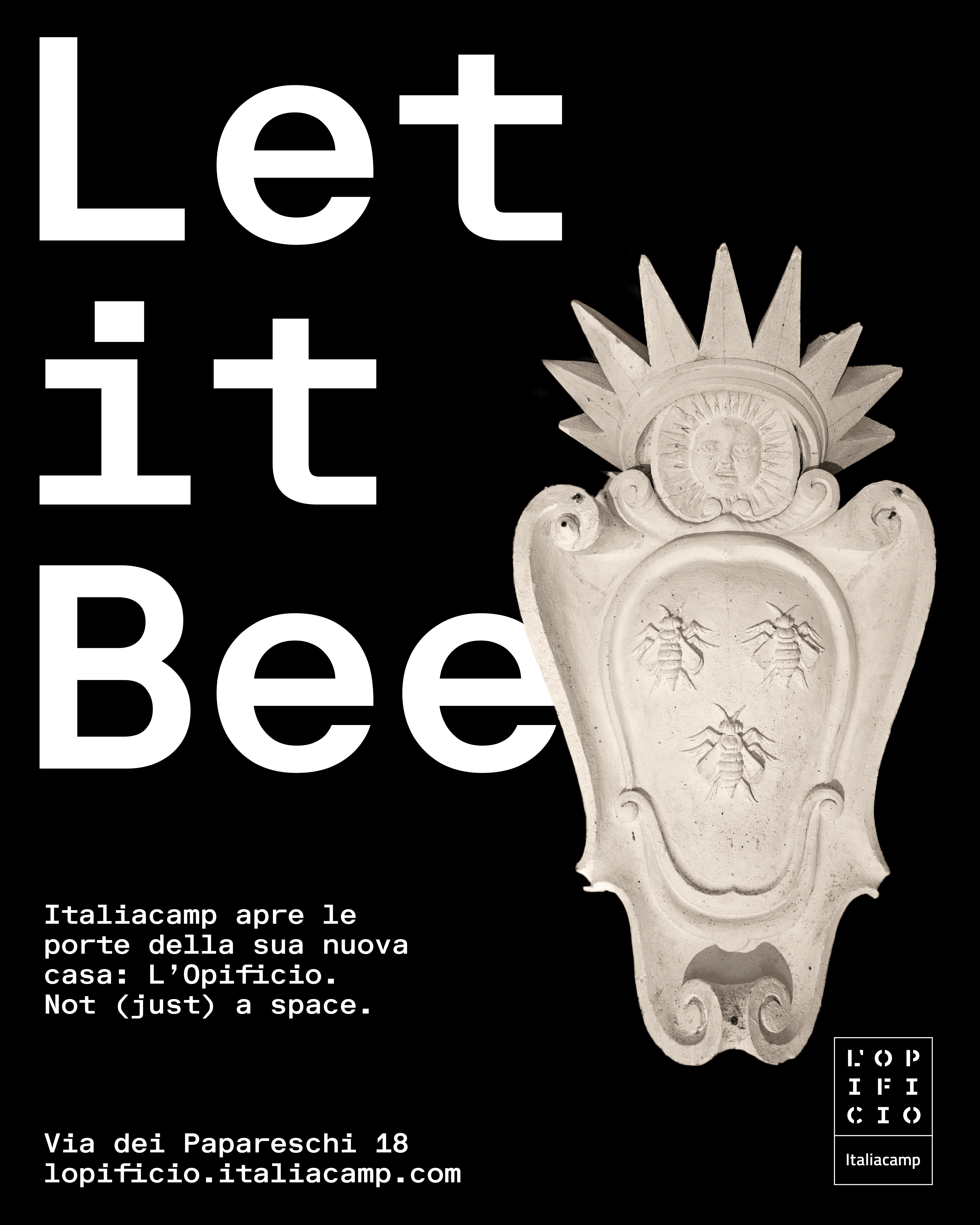
L’OPIFICIO

Italiacamp

Art Direction

Video campaign

Website Design

Visual language

At L’Opificio Italiacamp in Rome — a contemporary space born in a former marble workshop — the visual journey began with the existing logotype, originally created by @Andrea Magnini. We approached it not as a finished object, but as a starting point for developing a broader identity system.

Its stencils became tools: a generative system able to adapt, expand, and structure communication. The choice of the typeface Riforma Mono from Lineto Type Foundry reinforced this approach: its monospaced rhythm and quasi-monolinear weight embodying modularity, echoing the very idea of structure as play.

Inside the space, history was present too. Plaster casts — once religious, solemn, heavy with tradition — were reimagined in the campaign. Turned into carriers of witty wordplays, they brought irony and lightness to a charged heritage.

This is what contemporary design in Rome can be: not about replacing what exists, but about letting it resonate in new voices.